Showing posts with label User interface. Show all posts

Thursday, April 30, 2015

Google Flights Uses Material Design

Google Flights, one of the most underrated Google services, has a new interface powered by Material Design. There's a new hamburger-style menu that lets you quickly find your saved flights, explore a clever map with potential destinations, change currency and language.


Google shows the best flights at the top of the list of results. "We chose these itineraries to give you the best trade-off between price, duration, number of stops, and sometimes other factors such as amenities and baggage fees," informs Google.


This video from 2014 shows the old interface:


{ Thanks, Emanuele Bartolomucci. }

Friday, April 24, 2015

YouTube Tests Borderless Search Box

YouTube tests a new search box. There are a few changes: YouTube no longer uses a search button, a small icon is placed next to the search box, there's a "Search YouTube" message inside the search box until you type a query and the search box doesn't have a border.


Here's the regular YouTube interface:


How to enable the experimental search box? If you use Chrome, Firefox, Opera, Safari or Internet Explorer:

1. open youtube.com in a new tab

2. load your browser's developer console:

* Chrome or Opera 15+ - press Ctrl+Shift+J for Windows/Linux/ChromeOS or Command-Option-J for Mac

* Firefox - press Ctrl+Shift+K for Windows/Linux or Command-Option-K for Mac

* Internet Explorer 8+ - press F12 and select the "Console" tab

* Safari 6+ - if you haven't enabled the Develop menu, open Preferences from the Safari menu, go to the Advanced tab and check "Show Develop menu in menu bar". Close Preferences and then press Command-Option-C to show the console.

* Opera 12 - press Ctrl+Shift+I for Windows/Linux or Command-Option-I for Mac, then click "Console".

3. paste the following code which changes a YouTube cookie:

document.cookie="VISITOR_INFO1_LIVE=0pBX9w1K8gk; path=/; domain=.youtube.com";window.location.reload();

4. press Enter and close the console.

To disable the experiment, use the same instructions, but replace the code from step 3 with this one:

document.cookie="VISITOR_INFO1_LIVE=; path=/; domain=.youtube.com";window.location.reload();

{ Thanks, Matthew Bohr. }

Saturday, April 11, 2015

YouTube Tests New Video Player for Desktop

YouTube tests a new HTML5 video player with a transparent control bar that hides when you're not using it, just like mobile video players.


After a few seconds, controls disappear.


This screenshot shows both the experimental player (at the top) and the regular player (at the bottom). As you can see, the "watch later" button is not available in the new player. Another change is that the seek bar is thinner and it's enlarged when you mouse over the bar.


The experimental player has bigger and bolder icons. Toggles for autoplay and annotations look better, while dropdowns for speed and quality are replaced by mobile-inspired menus.


If you want to enable the experimental player, you need to change the cookie value for VISITOR_INFO1_LIVE to Q06SngRDTGA. If you use Chrome, install EditThisCookie, open youtube.com, click the extension's button and change the value for VISITOR_INFO1_LIVE. Make sure that you're using the English (US) interface.


{ Thanks, Angelo Giuffrida and Sterling Alvarez. }

Thursday, April 2, 2015

Google's Colorful Help Centers

Google's help centers have switched to Material Design. Help centers use different colors, much like the mobile apps. Gmail's help center uses a red background for navigation elements and it's annoying because it distracts you from the article.


Chrome's help center uses blue and it's interesting to notice that the sidebar stands out more than the article. There are many other services that have blue help centers: Search, Calendar, AdWords, AdSense, AdWords, Maps.


Here's the homepage for Google Drive's help center. The transition between Google's help centers is jarring because they look so different now. Colors should be used sparingly and shouldn't distract from the main content.


{ Thanks, Mohamed. }

Sunday, March 22, 2015

Colorful Knowledge Graph Cards

Last month, Google tested some colorful cards for mobile search results. Now Google's mobile site shows Knowledge Graph cards with colorful backgrounds, but only if you're not signed in.


It's not clear if Google uses random colors or they're related to the image search results.

{ Thanks, Shinohara Makoto. }

Tuesday, March 3, 2015

Google Tests New Contacts Interface

Google released a preview of the new Google Contacts interface. Powered by Material Design, the new Google Contacts improves some of the existing features: finding duplicates, Google Profile integration, while adding some new features: a list of recent messages, Hangouts sidebar, global search results from Google+. It also merges your contacts with your Google+ circles and no longer uses pagination.


"The new Google Contacts comes with a fresh look and feel, and conveniently pools together all your contacts, circles, and the people you talk to most in Gmail," informs Google. Starred contacts and frequently contacted people are placed at the top of the page, followed by your entire address book, which now includes your Google+ circles. You can customize "your circles" and exclude one or more Google+ circles.


Google Contacts now finds duplicates automatically and offers to merge all of them. You can dismiss some of the suggestions and better assess if they are actually duplicates.


When you click a contact, Google now opens a card overlay with a bigger picture and more information from the Google Profile page. Google also shows the most recent email conversations and meetings with that person.


The search feature now includes results from Google+. The first results are from your contact list ("personal results"), while the following results are from Google+ ("global results").


Some features aren't available yet in the new Google Contacts: importing/exporting contacts, restoring contacts, printing contacts, keyboard shortcuts. You can still find them in the old version of Google Contacts. For now, the new Google Contacts is not available for Google Apps users.

The new interface can be found at contacts.google.com/preview and it will be added to Gmail's contact manager over the next few weeks. You can also open Google Contacts and click "Try Contacts preview" in the left sidebar.

How to go back to the old interface? Expand the "more" section and click "Leave the Contacts preview".

{ Thanks, Daniel Sadavoy. }

Monday, February 23, 2015

Mobile Google Tests Colorful Cards

Google's mobile site experiments with a new card UI. There are a few changes: each search result has its own card and cards have colorful borders.

The screenshot below shows Google's Japanese interface, but it looks like this is a global experiment. You can find more screenshots at Baka-Ke.com and Android Police.


{ Thanks, Shinohara Makoto and Florian Kiersch. }

Tuesday, February 17, 2015

Google Play Tests a Sidebar for Related Apps

Patryk Szczygłowski, a reader of this blog, noticed an experimental web interface for Google Play. The updated UI adds a sidebar that shows similar apps and other apps from the same developer. Right now, these lists of apps are placed at the bottom of the page, below the description, reviews, changelog and other information about the app.

"Please note, it doesn't fit my laptop screen 1366x768, but Google might enable this experiment for me, because I have been using an external Full HD screen for a week recently," says Patryk.


{ Thanks, Patryk. }

Friday, February 13, 2015

Material Design Refresh for Google Help Panes

Most Google services use floating help panes, so you can find relevant articles from the help center and read them inside the web app. Google Flight Search uses a new interface for the help panes, powered by Material Design. New icons, bigger headings and search box, new color palette.


You can check the new UI by visiting Google Flights and clicking Help. Google Maps, Gmail, Google Drive and other Google services still use the old interface.


The nice thing about Google's help panes is that they list contextually relevant articles. For example, if you go to Gmail's filters section from the settings page and click Help, you'll find articles about using filters, blocking unwanted emails and changing your Gmail settings.

{ via Florian Kiersch. }

YouTube Tests New Logo

YouTube's site tests a new logo that looks just like YouTube's mobile app icon. It's smaller, instantly recognizable and more consistent.


For some reason, YouTube still shows the old logo at the bottom of the page:


Here's the regular YouTube interface:

Friday, January 23, 2015

YouTube Tests Rounded Channel Icons

YouTube experiments with a slightly different interface that uses rounded icons for channels and moves the title and buttons like "add to" and "share" to the right.

Here's an image that shows both the experimental interface and YouTube's regular UI:


YouTube's mobile apps already use rounded icons, just like Google+ and Google's navigation bar. "If your Channel is merged with a Google+ profile or page, then your YouTube Channel Icon and your Google+ Profile Image are synched," informs YouTube's help center.

Saturday, January 10, 2015

Material Design for Google Maps Transit Directions

The desktop Google Maps got a Material Design update: the timetable for transit directions is now displayed in an overlay. Just click More options and times next to Google's transit directions to see the new interface. Here's an example.


"If you're taking public transit, you'll see details about the transit line, trip duration, and schedule. To see other public transit times and enter a specific time, click More options and times. From here, you can see key information: overall travel time for your route, time spent walking (dotted lines), time spent on transit (solid lines), transportation lines used. To see the next scheduled departure, click Leave now. Or choose a different time and date for your directions in the boxes at the top. Click on a trip to select it and see it on the map. Click Route options to narrow your directions down to a particular type of transit. You can also choose Fewer transfers and Less walking," informs Google.


{ Thanks, Emanuele Bartolomucci and Jérôme Flipo. }

Tuesday, January 6, 2015

YouTube Tests a Player With Hidden Controls

YouTube tests a new feature that hides the player's controls when you're watching a video. To see the controls, you need to mouse over the player and you'll be able to pause the video, use the seek bar, change the volume, hide annotations, switch to the theater mode, play the video in full screen. Player controls are always displayed when the video is paused and after the video ends.


While the interface is cleaner and it focuses more on the video that's currently playing, a small seek bar would still be useful, so you don't have to keep moving your mouse to find when the video ends.

Here's how you can enable the experimental player. If you use Chrome, Firefox, Opera, Safari or Internet Explorer:

1. open youtube.com in a new tab

2. load your browser's developer console:

* Chrome or Opera 15+ - press Ctrl+Shift+J for Windows/Linux/ChromeOS or Command-Option-J for Mac

* Firefox - press Ctrl+Shift+K for Windows/Linux or Command-Option-K for Mac

* Internet Explorer 8+ - press F12 and select the "Console" tab

* Safari 6+ - if you haven't enabled the Develop menu, open Preferences from the Safari menu, go to the Advanced tab and check "Show Develop menu in menu bar". Close Preferences and then press Command-Option-C to show the console.

* Opera 12 - press Ctrl+Shift+I for Windows/Linux or Command-Option-I for Mac, then click "Console".

3. paste the following code which changes a YouTube cookie:

document.cookie="VISITOR_INFO1_LIVE=SR64eWDDWNU; path=/; domain=.youtube.com";window.location.reload();

4. press Enter and close the console.

To disable the experiment, use the same instructions, but replace the code from step 3 with this one:

document.cookie="VISITOR_INFO1_LIVE=; path=/; domain=.youtube.com";window.location.reload();

{ via Rubén Gómez }

Tuesday, December 30, 2014

YouTube's Roboto Experiment

YouTube experiments with switching from Arial to Roboto, a typeface that's already used by many other Google products. Roboto "was designed entirely in-house at Google by Christian Robertson, an interface designer for Google" and it "was released for the first time in 2011 with Android 4.0".

Here's the Roboto font experiment:


... and YouTube's regular interface which uses Arial:


This is a screenshot from Google Docs, which shows a sample text that uses Roboto and Arial:


Here's how you can enable the experimental interface. If you use Chrome, Firefox, Opera, Safari or Internet Explorer 8+:

1. open youtube.com in a new tab

2. load your browser's developer console:

* Chrome or Opera 15+ - press Ctrl+Shift+J for Windows/Linux/ChromeOS or Command-Option-J for Mac

* Firefox - press Ctrl+Shift+K for Windows/Linux or Command-Option-K for Mac

* Internet Explorer 8+ - press F12 and select the "Console" tab

* Safari 6+ - if you haven't enabled the Develop menu, open Preferences from the Safari menu, go to the Advanced tab and check "Show Develop menu in menu bar". Close Preferences and then press Command-Option-C to show the console.

* Opera 12 - press Ctrl+Shift+I for Windows/Linux or Command-Option-I for Mac, then click "Console".

3. paste the following code which changes a YouTube cookie:

document.cookie="VISITOR_INFO1_LIVE=vuYbQD3x-HQ; path=/; domain=.youtube.com";window.location.reload();

4. press Enter and close the console.

To disable the experiment, use the same instructions, but replace the code from step 3 with this one:

document.cookie="VISITOR_INFO1_LIVE=; path=/; domain=.youtube.com";window.location.reload();

{ Thanks, Rubén Gómez. }

Monday, December 15, 2014

New Google+ Notification Icons

There's a new Google+ notification icon in Google's navigation bar. When you have one or more notifications, Google only shows the red circle, which is now bigger.


If you don't have notifications, you'll see this new bell icon:


Here's the old bell icon:


{ Thanks, Alfredo Hernández. }

Thursday, December 11, 2014

New Interface for Google Account Settings

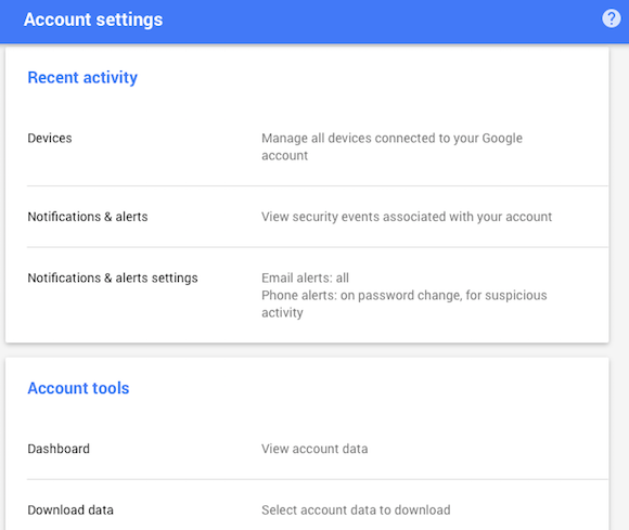
The settings page for Google Accounts has a new URL: myaccount.google.com and a new interface powered by Material Design. The page is now responsive, it no longer uses tabs and it shows more information at a glance.


Some of the sections have been updated to Material Design, while others still use the old interface.


{ via Florian Kiersch. }